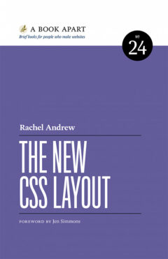
The New CSS Layout
By Rachel Andrew. New York: A Book Apart, 2017. 131 pages. ISBN: 978-1-937557-68-3.
Two decades ago, I taught myself how to create websites using Hypertext Markup Language (HTML) and Cascading Style Sheets (CSS). Come fall semester, I again will be teaching undergraduates how to do the same. To brush up on some of the latest thinking about how best to blend HTML and CSS to reach a desired outcome, I picked up Rachel Andrew’s The New CSS Layout.
Andrew offers a short history of how the structure and presentation of websites evolved from forcing layout into tables, the use of floats, and the development of Responsive Web Design, which was outlined seven years ago in Ethan Marcotte’s now classic book. An essential goal of Responsive Web Design is creating an online presentation that allows the same content to seamlessly display across the various devices we use today: desktop and laptop computers, tablets, smart phones, watches, etc. The producer of the content does not have to create different versions for different devices. Instead, the presentation “responds” to whichever device is being used to view the content.
After pointing out some of the limitations of these early solutions to website layout, Andrew examines two new methods — the Flexible Box Module, or flexbox, and Grid Layout. Compared to the early specifications of CSS, both of these approaches offer much greater control over the design of websites. Flexbox allows the designer to create multicolumn and responsive designs with much less fuss than working with tables or floats. Grid Layout, once its logic becomes clear to the designer, provides even more control.
Advanced websites, often created by a disparate team of coders, today may employ any number of tools to tweak presentation. Andrew mentions the use of CSS architectures (such as Object Oriented CSS) and frameworks (such as Bootstrap), as well as pre- and post-processors, which are commonly used in large-scale projects. Andrew notes that these approaches “may seem like overkill if you are the only person who touches the CSS on the sites you build. Why makes things so complicated?” But, she adds, if lots of people work on a site, the approaches make sense.
The question for me is whether I should be letting my journalism and communication students know about these approaches. The short answer is no. The course in online media production that I teach at the University of Wisconsin-River Falls is introductory. If anecdotal evidence from previous semesters is a guide, most of the students never will have seen HTML or CSS, so they will have a lot of other aspects of web design to learn before trying to tackle flexbox or Grid Layout. I tell students that one goal I have is that upon completion of the course, they have enough knowledge to know what needs fixing when a website doesn’t perform as expected.
That’s not to say I will hide the information from them. As Andrew points out, “CSS is changing and developing at a rapid rate.” Students need to understand that the foundation of website coding that they will learn in my course is just the start. If they fall in love with the web the way that I did two decades ago, they will pursue the new approaches on their own.
The book is one of the series of “brief books for people who make websites,” according to the motto of the publisher, A Book Apart. The series, which now includes 27 titles, is highly recommended for anyone interested in making websites. The books cover topics such as coding, typography, design — all important aspects of working with online media. The series also has some unexpected titles, such as Lara Hogan’s Demystifying Public Speaking, but they make sense considering the broader context of digital work.
Accessed on 27 Apr 2024.
The article may be found online at https://straumanis.com/2018/new-css-layout/.
